Public’s interest in type design (and more in general graphic art) continues to grow. The 1990’s shift to digital technologies and the Internet gave birth to a period of intense creativity around it. To its devotees, typefaces can build a certain order that creates a sense of recognition and trust in the readers, and help convey a message better.
The Arabic script has had benefits from the vibrant world of present-day “webfont” era, too.
Lebanese type and graphic designer Pascal Zoghbi is of the same opinion. He runs 29Letters (29LT), an award-winning design studio in Beirut specializing in contemporary Arabic type.
Advanced digital technology has made it easier for him to design the Arabic script – a cursive writing that consists in three to four shapes per letter, that change depending on where the letter is in the word.
“I have always found myself interested in letterforms. I am curious about the calligraphic and typographic aspects of the Arabic script more than the language itself”, he says in a Skype conversation.
Zoghbi seeks to bridge not only design gaps, but also linguistic ones. Through 29LT’s studio in Beirut, he works on a global approach to type design: multilingual typefaces, or fonts that contain a character set of several scripts supporting many languages.
Not just for geeks
Meeting a growing demand among international corporations that choose MENA for their next business, 29Letters (the name is inspired by the 28 letters of the Arabic alphabet plus the letter hamza) is today a small but well-established independent and digital type foundry.
Zoghbi works with a handful of international designers from different desks in Europe and the Middle East. Outside special commissions, a set of fonts are available to buy and download from 29LT’s website. When Zoghbi started 29LT in 2012, it was one of the first entrepreneurs of this kind in the region, he believes. Swatch and Expo 2020 Dubai are now among its clients, while his Noto Naskh typeface is used for the Google’s Arabic web and mobile content.

Zarid is 29LT’s latest typeface creation. “In 2008 a newspaper in Dubai asked me to design a new and exclusive Arabic headlines font,” says Zoghbi. “After five years, the copy
right went back to 29LT (big corporations own the rights to their commissions, ndr) and I decided to expand the headlines black weight into a type-family of eight weights and developing a Latin counterpart for it.” With the help of type andgraphic designer Khajag Apelian who handled the Latin character set, Zoghbi took three years to create a vigorous and strong multilingual typeface that is suitable for a wide range of literature and educational publications as well as branding and design projects of bold and thoughtful content. Zarid is a combination of an Arabic Naskh Mastari accompanied with a unique serif Latin counterpart, 29TL website explains.
Visual heritage
Arabic is the third script in use in the world after Latin and Chinese. But in 2013 there were only around 500 Arabic fonts, according to an article published by Al Bawaba.
“Only in recent times we have been dealing with true professionally trained and dedicated Arab type designers,” explains Bahia Shehab, Egyptian-Lebanese associate professor of practice in the Department of Arts at the American University in Cairo (AUC). Shehab, who is also the founder of AUC’s graphic design programme, believes in the importance of typefaces. “Fonts are the DNA of design. Ninety percent of what we design uses script to communicate,” she says in an interview via Skype.
She believes young aspirant designers cannot plunge into creating without a solid background and knowledge of their design tradition. With a technology that virtually allows anyone with a personal computer to draw or customize his one typeface, “in many cases the fonts that we have now are badly adapted copies of a 1,000-year-old script,” she explains.
Shehab – whose work has been focusing on ancient Arabic script and how it might be used to solve contemporary design issues – has been compiling examples of Arabic calligraphy from the past, in preparation for an encyclopedia of the Arabic script that can inspire a new generation of type designers. “When you look at the examples of Arabic calligraphy in history, you can find very beautiful ones in the manuscripts or on buildings’ façades,” she says.
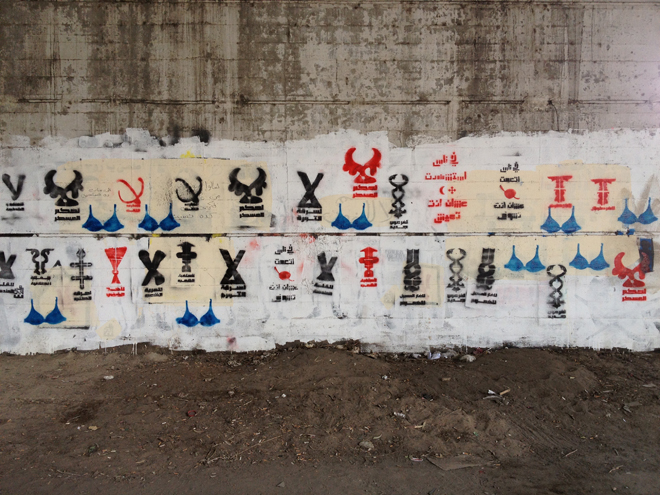
She has also developed alternative approaches to typography and graphic art as design for communication. In the installation A Thousand Times NO (Plexiglass curtain. 2.5 m x 6 m and 1016 page book, 2010) she has documented thousands of ways to write the Arabic character Lam-Alif (which makes up the word NO in Arabic), collecting examples of design and calligraphy in the Islamic history. The project evokes the richness of the evolution of the Arabic script.

This year Shehab has been shortlisted for the 4th edition of the Jameel Prize, the Victoria & Albert Museum’s international award for contemporary art and design inspired by Islamic tradition.
Zoghbi also teaches design, and typography classes, at the American University in Beirut and the Lebanese American University, and in 2011 co-authored Arabic Graffiti, a publication looking into Arabic calligraphy and typography through the works of urban artists. He was one of the finalists at Jameel Prize in the 3rd edition. “What I always try to do – he says – is not to stick to the traditional calligraphic styles and at the same time I try not to be too experimental. I try to find a worldbetween these two extremes to develop contemporary typefaces.”

Public’s interest in type design (and more in general graphic art) continues to grow. The 1990’s shift to digital technologies and the Internet gave birth to a period of intense creativity around it. To its devotees, typefaces can build a certain order that creates a sense of recognition and trust in the readers, and help convey a message better.


